-
Economic Perspectives
The "Powell Pivot"
January 2024

- Filename
- Economic Perspectives JANUARY 2024.pdf
- Format
- application/pdf
TRANSCRIPT
It’s really a very exciting time for the U.S. economy. You could say it’s sitting at a sweet spot. Inflationary pressures have declined significantly since the economic peak in 2022. The pace of economic growth remains robust, with continued gains and payrolls and personal spending remaining quite strong. On top of that, the Fed has announced that they plan to reduce the federal funds rate by 75 basis points (bps) from the current level — this is a critical development.
The Fed’s decision to stop raising interest rates and start lowering interest rates has become what’s known as the “Powell pivot.” This is the transition from the Fed’s very hawkish stance against inflation to a more balanced approach toward low and sustainable inflation.
Furthermore, with the unemployment rate being relatively low, that will help continue to keep economic growth going.
The Fed now believes that inflation will reach its target of 2%, so they’re focused on ensuring that the economy does not enter a recession. To help ensure that will happen, the Fed thinks that by year-end, they will drop the rates, as I mentioned earlier.
Now, the financial markets are a little bit more aggressive than the Fed. They think that there will probably be five or maybe even six cuts of 25 bps this year.
Now our view is not as aggressive as the financial markets, so this month, we thought we’d do a deep dive into what’s happening with inflation.
Inflation Measurements
% change, y-o-y, seasonally adjusted

Data current as of January 25, 2023
Sources: Bureau of Economic Analysis, Bureau of Labor Statistics
Information is subject to change and is not a guarantee of future results.
Chart 1: 1:43– Now in regard to inflation, there are several measurements that are out there. The most popular is this one here, the consumer price index, or CPI, has been around since the early 1900s. It’s used often for cost-of-living adjustments, most notably with Social Security, but with many other contracts too. It is a price measurement of a fixed basket of goods and services.
But this, although it’s popular with many people, is not the Fed’s most favorite measurement of inflation.
That one belongs to the PCE, or the personal consumption expenditures price index, the blue line in this chart. Now often, when the Fed’s looking at this, they focus much more on the core number, meaning that they take away the volatile food and energy components.
Yes, the Fed does know that households spend an awful lot of money on food and energy, but the Fed cannot control those prices through monetary policy. Energy prices tend to be dictated by geopolitical issues, and food prices tend to be dictated by weather or, to some extent, geopolitical issues that we’ve seen in the last few years.
But the PCE price index, as it’s called for short, is a more accurate measurement of price changes based on actual consumer spending. It allows for substitution, so for example, if beef prices are too high and a homeowner decides to buy chicken instead, that will be reflected in the pricing here. That does not happen with the CPI because that’s a fixed basket of goods and services.
Furthermore, the PCE price index has a much more normal way of looking at both housing pricing and medical service pricing, so it’s become the favorite one of the Fed.
Core Personal Consumption Expenditure Price Index
% change, seasonally adjusted

Data current as of January 25, 2023
Source: Bureau of Labor Statistics
Information is subject to change and is not a guarantee of future results.
Chart 2: 3:30– On this chart, it shows the performance of the core PCE over the last few years. The columns are showing the three-month change, and that’s annualized.
The dark-blue line is the year-over-year change, and the bright-blue line is a six-month change. And that’s probably the good news that the market is focused on right now because you can see the six-month annualized change is below 2% — it’s sitting at just 1.9%.
PCE Price Index - Components
% change y-o-y, seasonally adjusted
Data current as of January 25, 2023
Source: Bureau of Labor Statistics
Information is subject to change and is not a guarantee of future results.
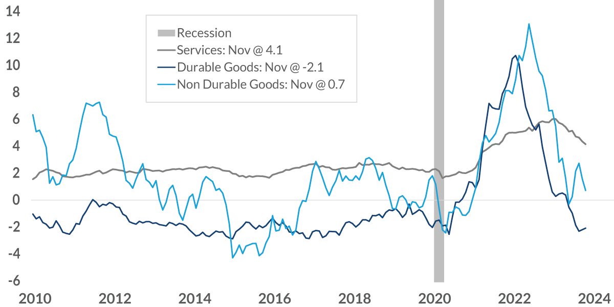
Chart 3: 3:58– But the price movement has not been very homogeneous. What we’re seeing is different sectors of the economy having different price pressures that are occurring.
In this chart, the two blue lines, the dark blue and the light blue, represent both durable goods and nondurable goods, and you can see that, by and large, those prices on a year-over-year basis are close to zero. But the gray line, the service prices, you can see, continue to be elevated, and it is only falling at a very slow pace. And this, of course, is a concern for the Fed. Just take a look at the price performance to the right side of the recession, the gray column, and what it was like before the recession. As you can see, we really haven’t returned to what we had before the pandemic and the recession, and that’s exactly what the Fed would like to see.
PCE Price Index: Distribution of Component Price Change
% change, not seasonally adjusted
Data current as of January 25, 2023
Source: Bureau of Economic Analysis NOTE: Dotted line is a linear trend line of positive increases
Information is subject to change and is not a guarantee of future results.
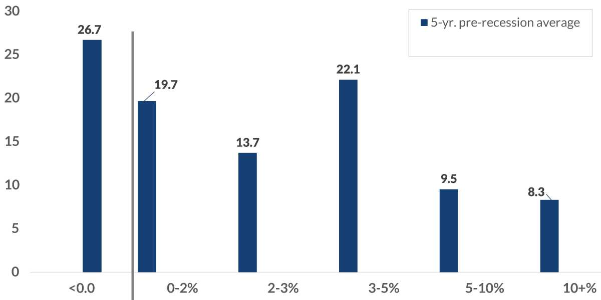
Chart 4: 4:47– Now to get some historical perspective of what inflation used to be like beforehand, I have this chart here. It shows the price change of different segments of the personal consumption expenditure index, and as you can see over on the left-hand side, that 26.7% of the index actually fell in price for the five years before the pandemic; 19.7% increased somewhere between 0 and 2%, so 46.4%, or almost half of it, was performing exactly how the Fed wanted it to perform, and then there are other portions of it that increased at bigger and bigger amounts.
If we put a linear trend line, you can see it is skewed significantly where price decreases or small increases were much greater than what we had for large increase.
Now let’s take a look at what’s been going on the last three months. These are the light-blue columns that you see here. As you can see, yes, prices have been falling in certain sectors, but take a look at the rest of the changes going on, and you can see that they’re skewed much more towards bigger and bigger increases. If we put a trend line here, you can see it’s skewed to the higher end — this is a concern for the Fed because this is telling us that the underlying components are still extremely volatile, and that makes it much more difficult for the Fed to be comfortable in the fact that inflation is moving to a sustainable level.
Core PCE Price Index
%, 3-month annualized change, seasonally adjusted, as of November 2023
Data current as of January 25, 2023
Source: Bureau of Labor Statistics
Information is subject to change and is not a guarantee of future results.
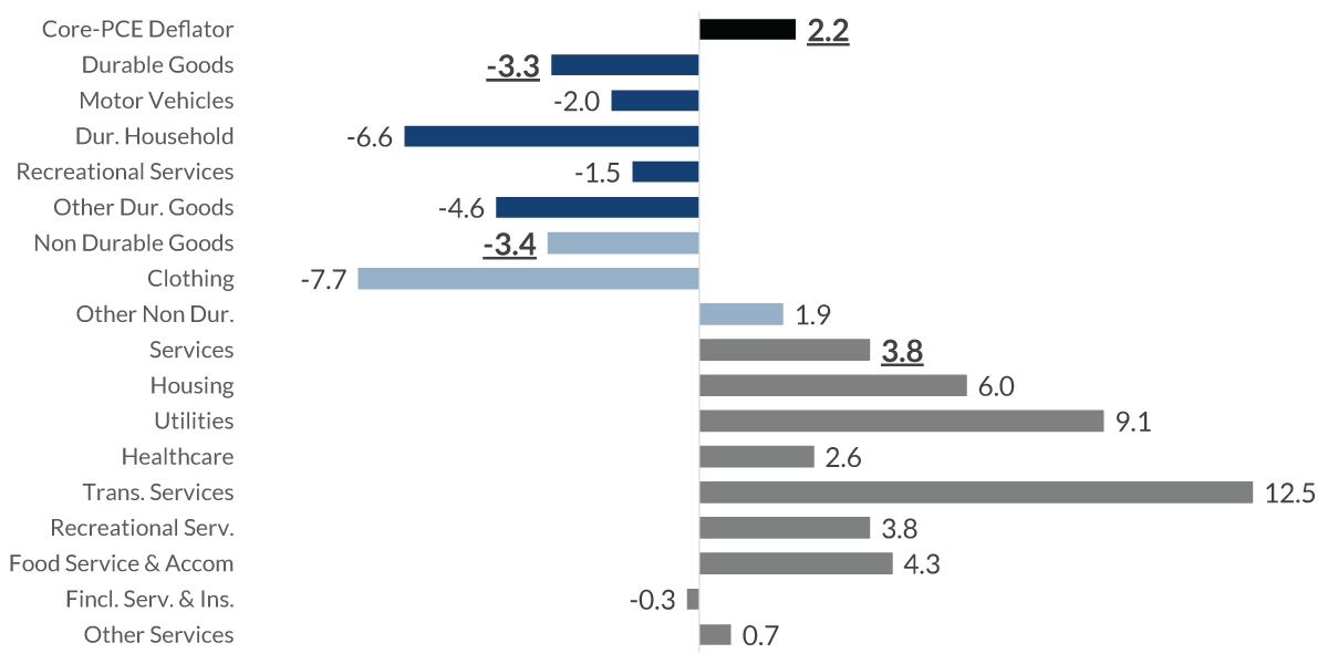
Chart 5: 6:19– And just to take this one step more, this is a breakdown of all the major categories within the PCE price index. The blue, both dark and light lines, you can see are generally in the negative territory. Those prices all have been falling in the last three months on an annualized basis, but the services are all in the positive territory. The bigger concern for this is that services make up two thirds of this index, so that’s what’s keeping it in the higher territory.
Federal Funds Rate: Expectations (%)
Data current as of January 25, 2023
Sources: Federal Reserve, Bloomberg WIRP Page, CNR Research
Information is subject to change and is not a guarantee of future results.
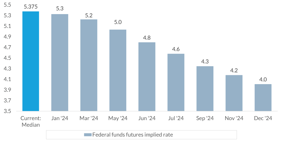
Chart 6: 6:49– Now this chart shows the expectations for how the Fed is going to react to the economy as the year goes on. The bright-blue column on the left-hand side is the current level of the federal funds rate, the median rate of 5.375%.
The gray-blue columns that you see after that are the federal fund’s future contracts in terms of its implied rate of what it will be at each one of the FOMC’s (Federal Open Market Committee’s) meetings during the course of the year. And as you can see, the market’s expecting the Fed to be lowering interest rates throughout the year, ending the year at 4%.
Now this dark-gray line is the Fed’s expectation in terms of what’s going to happen.
All we know from the Fed is that they think the federal funds rate will end the year at 4.625%, so it’s just a linear line that we’ve put in to replicate the movement by the Fed.
In this final chart, we’re adding in what we at City National Rochdale believe will happen — the dark blue line. As you can see, we do not expect the Fed to lower interest rates until the second half of the year. At which point, we think that they’ll lower them by two or three times, or a total of 50-75 basis points.
Summary: 7:59– Now, inflation does not need to be at 2% for the Fed to start their easing of monetary policy. The Fed has stated that it needs to believe that inflation is on a path to 2% and can be sustained at that level.
Because of the moderation and price declines and the wide distribution of price movement, we believe that the Fed will probably want to wait until the second half of the year, as I said beforehand, before they start reducing interest rates.
Important Information
The information presented does not involve the rendering of personalized investment, financial, legal, or tax advice. This presentation is not an offer to buy or sell, or a solicitation of any offer to buy or sell any of the securities mentioned herein.
Certain statements contained herein may constitute projections, forecasts and other forward-looking statements, which do not reflect actual results and are based primarily upon a hypothetical set of assumptions applied to certain historical financial information. Viewers are cautioned that such forward-looking statements are not a guarantee of future results, involve risks and uncertainties, and actual results may differ materially from those statements. Certain information has been provided by third-party sources and, although believed to be reliable, it has not been independently verified and its accuracy or completeness cannot be guaranteed.
Any opinions, projections, forecasts, and forward-looking statements presented herein are valid as of the date of this video’s distribution and are subject to change.
Past performance or performance based upon assumptions is no guarantee of future results.
All investing is subject to risk, including the possible loss of the money you invest. As with any investment strategy, there is no guarantee that investment objectives will be met and investors may lose money. Diversification does not ensure a profit or protect against a loss in a declining market.
City National Rochdale, LLC, is a SEC-registered investment adviser and wholly owned subsidiary of City National Bank. Registration as an investment adviser does not imply any level of skill or expertise. City National Bank and City National Rochdale are subsidiaries of Royal Bank of Canada.