
-
Economic Perspectives
The Federal Debt: A Growing Concern
November 2023

- Filename
- Economic Perspectives NOVEMBER 2023.pdf
- Format
- application/pdf
TRANSCRIPT
In this month's segment, we are focusing heavily on the federal debt.
Finances in the United States have been a big topic throughout this entire year. For much of the first half of this year, the focus was really on the debt ceiling, with the primary question being, “How much debt should the U.S. government be allowed to take on?” This issue was finally resolved in early June, where there was a suspension of the debt ceiling until January 1, 2025, after the next presidential election.
However, there is still an issue: Since the debt ceiling debacle was resolved, federal debt has increased by $2.2 trillion dollars — moving the total amount of debt up to $33.7 trillion dollars.
Just last week, Moody's downgraded the outlook on U.S. Treasury debt from “stable” to “negative.” It's still rated AAA by Moody's, but that rating is moving in the same direction already taken by Fitch and Standard & Poor’s, who have downgraded the debt to AA+.
There are some real concerns out there about the amount of debt that is being issued. This month, we are going to look at a number of charts to get a deeper understanding of the U.S. debt.
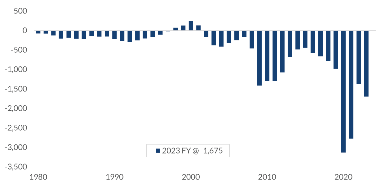
Chart 1: 1:26 – This first chart shows the federal government's deficit, or surplus, since 1980. Over on the right-hand side, you can see that for the fiscal year that ended just this past September, we had an annual deficit of $1.7 trillion. You can also see from this chart that the deficit over the past decade or so has been much greater than we have seen in previous decades.
Federal Deficit
$ billions of dollars
Data current as of November 10, 2023
Source: U.S. Treasury
Information is subject to change and is not a guarantee of future results.
Some of this has to do with the fact that we had two very severe recessions, along with a pandemic, but there is another part to the story. The government has been borrowing to address these fiscal challenges, but tax revenue has not been enough to keep up with this borrowing — so the deficit keeps getting larger and larger.
The highlighted portion of this chart is the late 1990s, when the U.S. government was running a budget surplus, but the world was very different back then than it is right now. At that time, President Clinton and House Speaker Gingrich were fighting over spending and taxation, but the United States was benefiting from the “Peace Dividend” (the economic boost a country gets from a period of peace that follows a war).
With the collapse of the Soviet Union in the early 1990s, we did not need to spend as much money on defenses. In addition, while some taxes were increased, the pace of spending was reduced significantly. This combination of lower spending and higher revenue moved us into a budget surplus for a number of years. However, all that changed quickly following September 11, after several tax cuts moved us back into the deficit position.
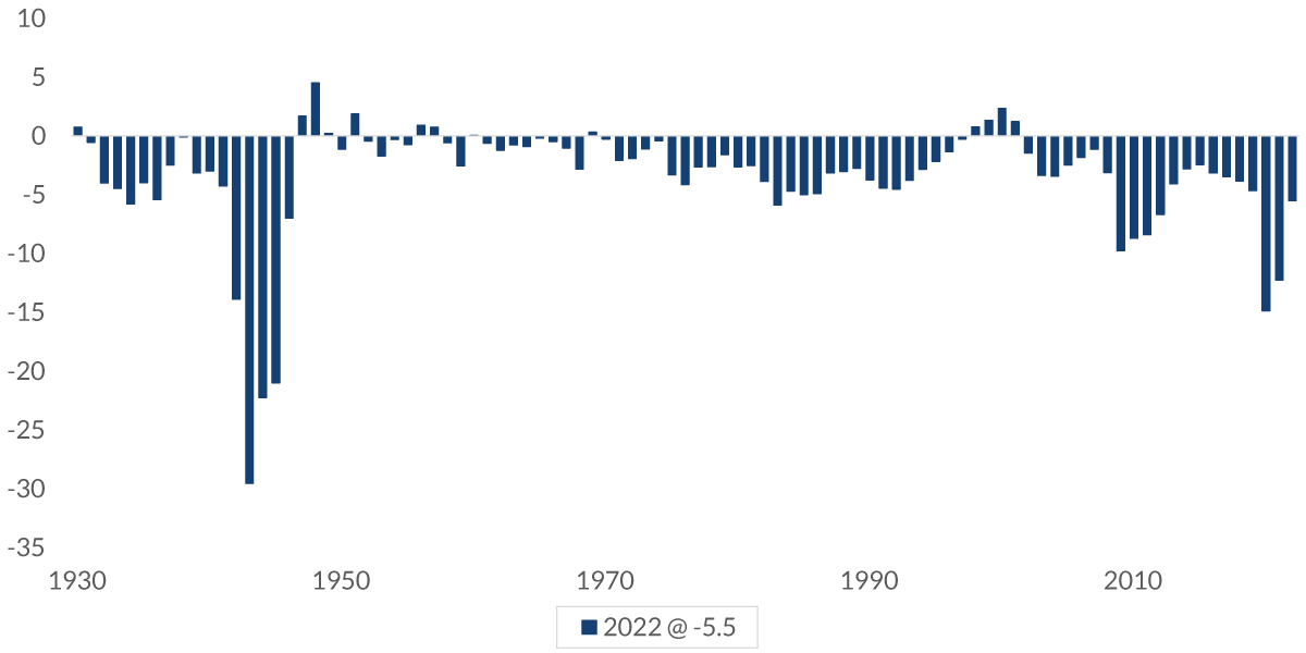
Chart 2: 2:51 – Now, in this chart, we're looking at the deficit over a longer period of time, from the 1930s forward. Because the government was a whole lot smaller back at the beginning of this time range than it is today, what we do to make comparisons across the years fair is to compare the deficit each year to the size of the economy at that time, and then measure it as a percentage. In this chart, you can see a couple of things — again, the deficit in the past decade or so is very high compared to what we have seen historically (with the exception, of course, of World War II). Revenues shrank and expenditures increased significantly during that time, leading to a deficit even higher than what we had during the Depression. So as you can see, on a historical basis, what we are dealing with right now is quite extreme.
Federal Surplus/Deficit as a Percent of GDP
%, annual
Data current as of November 10, 2023
Source: Office of Management and Budget
Information is subject to change and is not a guarantee of future results.
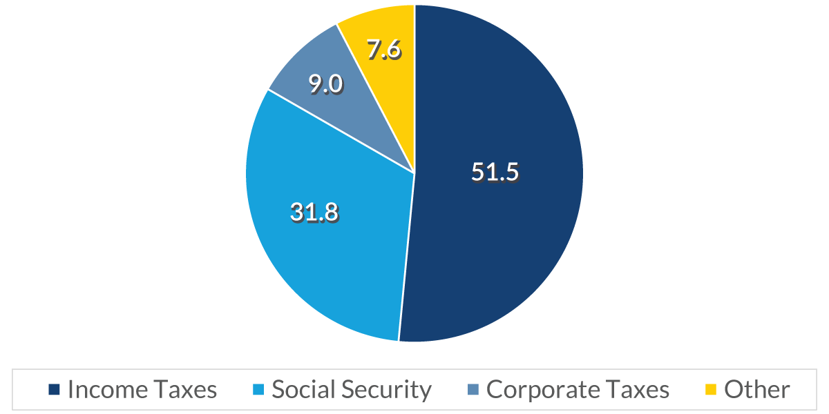
Chart 3: 3:35 – The following chart shows the source of the revenue coming in. Here, we are looking at the four key categories of tax receipts from the federal government.
Treasury Receipts: Source
%, average of past two years
Data current as of November 10, 2023
Source: U.S. Treasury
Information is subject to change and is not a guarantee of future results.
Income tax makes up the lion's share (52%) of the government’s tax revenue — not surprising, since we all feel that we pay our fair share of income taxes. The next largest contributor of tax revenue is Social Security tax, followed by corporate taxes, and finally, the “Other” category, which includes state taxes, gift taxes, and Customs duties.
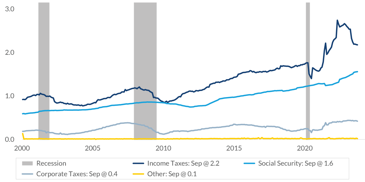
Chart 4: 4:07 – To give some added perspective to this overview, this next chart shows the time series of tax receipts.
Federal Tax Receipts
$, trillion, 12-month rolling total
Data current as of November 10, 2023
Sources: Bureau of Economic Analysis, Bureau of Labor Statistics
Information is subject to change and is not a guarantee of future results.
The lines show the 12-month rolling totals for the four major categories of tax receipts. At the top in navy blue is income tax revenue. You can see that this category peaked last year and has been on somewhat of a decline since then. There are several reasons for this decline. For one thing, tax receipts have not been as strong lately as in the past, mainly due to losses in the stock market last year (which reduced big, taxable capital gains). In addition, there have been delayed tax filings from a number of states due to natural disasters, with California (which is also the largest supplier of federal tax revenue) being the most prominent.
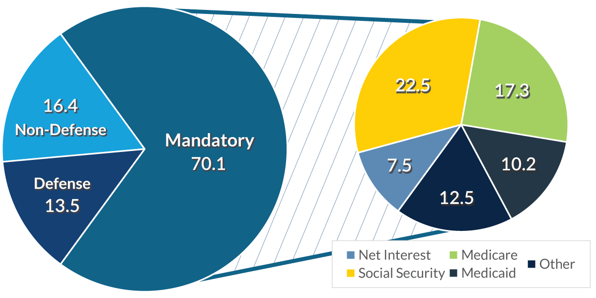
Chart 5: 4:46 – Federal outlays tell a different part of the story, as you can see in this next chart. This “spending” part of the story is much more nuanced than the summary of revenue coming in. On the left-hand side, you can see that significant portions of outlays are “mandatory”; these comprise more than 70% of federal spending. Mandatory outlays are government spending that does not go through the appropriations process in Congress. Instead, these payments must go out, no matter what —this includes Social Security payments, interest payments on the debt, Medicare, Medicaid, etc.
Federal Outlays
% of total
Data current as of November 10, 2023
Source: Congressional Budget Office
Information is subject to change and is not a guarantee of future results.
By contrast, “discretionary” spending amounts to only about a third of the total spent on mandatory outlays, and it is broken into both defense and non-defense expenditures in the chart. So clearly, to seriously reduce the size of the deficit, Congress would have to make cuts to the mandatory outlays. Since that idea is currently a bit of a political “hot potato,” we don't expect to see any changes to those outlays in the immediate future.
Up to this point, we've been talking about the annual deficit, but there's a more significant issue, and that's the total amount of debt that is owed by the government, known simply as “the debt.”
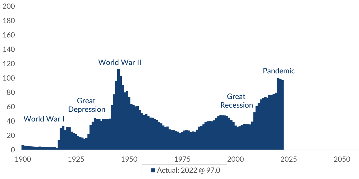
Chart 6: 5:59 – The debt, which is measured as a positive number in this chart, has shifted significantly over time. It tends to increase during wars and economic downturns, and it currently stands at 97% of GDP — the highest level we've seen since the end of World War II, when it was at 112%.
Federal Debt Held by the Public
percent of GDP
Data current as of November 10, 2023
Source: U.S. Treasury
Information is subject to change and is not a guarantee of future results.
It's interesting to note the significant decline in the debt relative to GDP from the end of World War II until the 1980s.
This debt reduction was not due to any frugality on the part of the federal government (which ran deficits for most of those years). Rather, it occurred because the economy was growing at such a strong pace (and much faster than the deficit) that the total debt shrank relative to the size of the economy.
A number of factors drove and sustained that strong economic growth. Following World War II, the U.S. enjoyed a period as the largest manufacturer in the world. The G.I. Bill produced many trained workers who fueled much greater economic outputs than had been possible before the war. And by the 1960s and 1970s, women were entering the workforce.
But since the 1980s, the rate of growth has slowed. The economic tailwinds are not nearly as strong today as they were in the past. At the same time, the rate of federal spending has increased significantly relative to the amount of revenue coming in. As a result, the total amount of debt has steadily increased and is now expected to grow to up to 180% of GDP over the next 30 years. The primary driver of that debt growth is interest payments on the debt, as can be seen in more detail in the next chart.
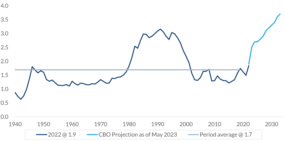
Chart 7: 7:42 – This chart shows the big change we're going to see take place in the amount of interest payments that need to be made on the debt.
U.S. Treasury: Net Interest Payments
as a percent of GDP
Data current as of November 10, 2023
Sources: U.S. Treasury, Congressional Budget Office
Information is subject to change and is not a guarantee of future results.
On average, since 1940, interest payments have been 1.7% of GDP, but you can see how this percentage is expected to increase significantly. By 2030, we’ll start to approach a level that's about twice the historical average.
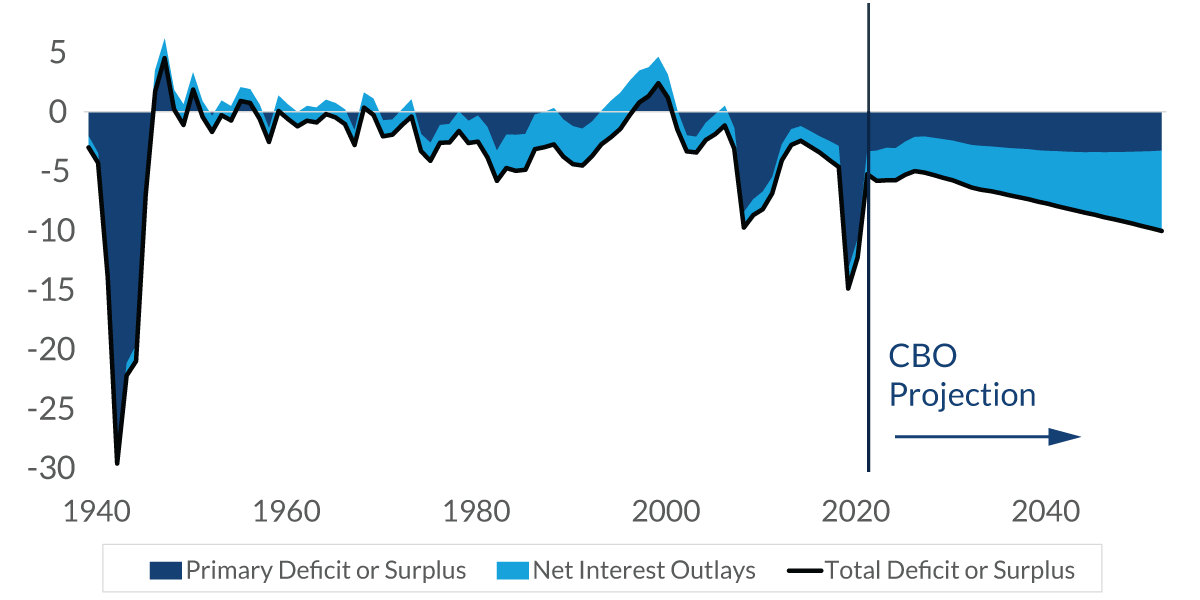
Chart 8: 8:06 – The next chart goes into greater detail, taking a look at the deficit relative to GDP and going forward for the next 30 years. You can see that the total amount of the deficit (relative to GDP) moves from roughly 6% to about 10%. The lighter blue is the interest rate portion. What will end up happening is that about two thirds of the deficit — a considerably large amount — will simply be interest payments on that debt.
Federal Deficit
% of GDP
Data current as of November 10, 2023
Source: U.S. Treasury
Information is subject to change and is not a guarantee of future results.
Chart 9: 8:36 – The next chart shows the average maturity of the outstanding debt. If you look over on the right-hand side, you’ll see that since the pandemic, when interest rates were really low, the Treasury has moved out the average maturity of its debt to lock in the lower yields. It is not a significant movement in terms of the amount of time, but it is at least some movement in the right direction.
U.S. Treasury: Average Maturity of Outstanding Debt
years, not seasonally adjusted
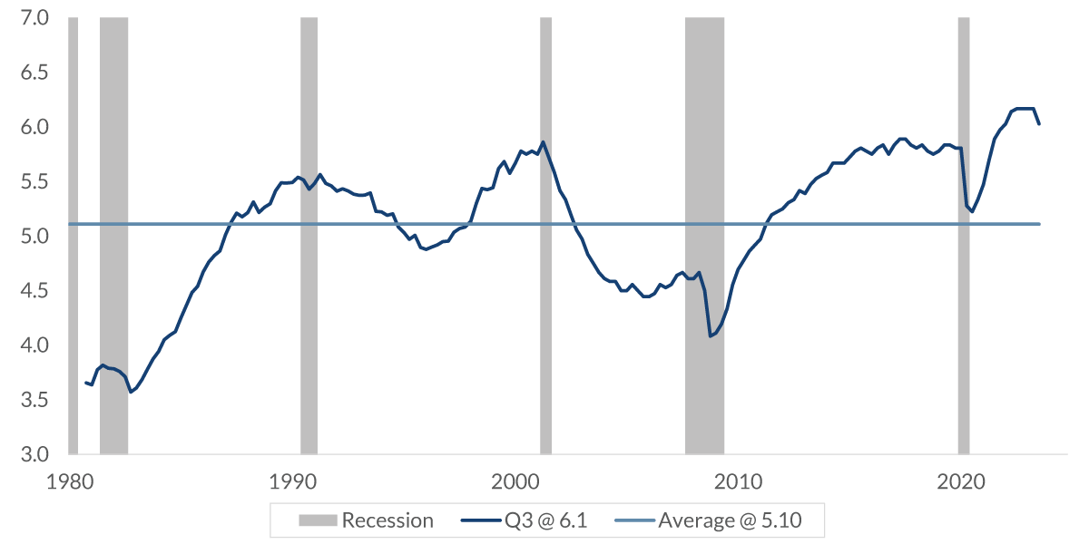
Data current as of November 10, 2023
Sources: Bureau of Economic Analysis, Bureau of Labor Statistics
Information is subject to change and is not a guarantee of future results.
Keep in mind: The goal of the Treasury is not to game the market or figure out where to issue the debt along the yield curve. Doing that would just add a great deal of uncertainty and volatility to the markets, inevitably leading to higher interest rates. Instead, as the largest issuer of debt in the world, The Treasury wants consistency, because that keeps volatility down and interest rates down. So they really don't game that system much at all.
Chart 10: 9:25 – The final chart puts into perspective the amount of debt that we have, relative to that of other countries within The Group of Eight (G8). For this chart, the debt is measured by a different source — the International Monetary Fund. The resulting numbers are a little different from what we’ve already seen, but the methodology used here is applied consistently to the eight countries. As you can see, our debt is neither the biggest nor the smallest, but just sort of in the middle.
Debt as a Percent of GDP
% debt as a percent of GDP, 2022
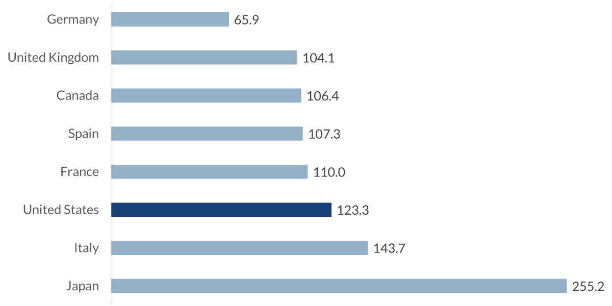
Data current as of November 10, 2023
Source: International Monetary Fund
Information is subject to change and is not a guarantee of future results.
Summary: 9:48 – So what do we make of all of this?
Just last month, Federal Reserve Chair Jay Powell said that the path we are on right now, in terms of federal debt, is not sustainable, and that the sooner we get off this path, the better off the country will be. In Congress, there is increasing political pressure on the Senate Appropriations Committee to address the growing debt and deficit spending, so we might start seeing some changes go on in the near future.
It is okay to have debt, but having too much becomes a problem. The question remains: What is “too much” debt? We honestly do not know.
That is the issue with debt: It is never a problem until it becomes one, and when it does, the problem is severe. Even so, as Alexander Hamilton once said, debt can be a blessing. It can facilitate trade, finance national defense, fight recessions, fund investments and provides liquidity. But it has to be stable and sustainable, and that is a tough thing to accomplish.
